3 West
Intro
For those of you who are already confused and think that 3 West is some new restaurant, night club or Television series, in this case 3 West is just museum jargon for the 3rd floor exhibit space in the west wing of the Smithsonian National Museum of American History. Besides the Ruby Slippers exhibition, as of yet, 3 West has been the largest project that I have had the opportunity to contribute to. Throughout this description, I will refer to space as 3W but it was not the entire wing that we worked on, just what we came to know as the “spine.” The spine is essentially the walkable area of 3W including a large objects display, new acquisitions cases, music lobbies, and window wells. Of these, I contributed to the large objects, music lobbies, and window wells.
3W was, in my mind, the best example of a project where you can’t always get what you want. No matter how many times we thought we finally conquered the project, someone higher up in the food chain would shoot it down.
My first experience with 3W was near the beginning of my internship. During one of our weekly meetings, all of the interns were essentially asked to drop everything that we were working on for the next two or three weeks and assist the senior designers in getting the conceptual package of 3W ready for presentation to the Director of the museum. Still being a novice at VectorWorks I was not able to contribute too much at this stage. This was a massively high profile project, as it would be a temporary two year (yes two years is temporary in Smithsonian-land) installation while the permanent popular culture galleries were conceived and executed. The exhibits would end up staying up for closer to four years due to the COVID pandemic.
For the remainder of my internship, I observed that 3W had become a constant game of push-pull between design and other departments bringing me to the realization that the dynamics of an exhibition projects were much more complex than I had imagined.
MUSIC LOBBIES/WINDOW WELLS
My contributions to the music lobbies were minimal but you can see them as of 2019. For most of the 3W projects, I was in charge of things like typesetting and carpet selection. The music lobbies and window wells actually have “sibling” carpets. The selection of carpets are both random black patterns with either a magenta or navy secondary color.
The most important and fun thing I contributed to the music lobbies was building a physical scale model to visually demonstrate how best to provide the groove for the labels. We had to be particularly creative with the labels because they would need to be changed frequently as the objects in those cases are still in use. We created a groove which allowed them to be easily swapped but also allowed them to be on a slight angle to improve readability.
Besides carpet selection my other main contribution to the window wells was the arrangement of the furniture. Though not a glamorous job, it improves install when it is clear where they are going.
LARGE OBJECTS
The large objects display has been through so many revisions it is hard to keep track. When I was first brought onto the project the objects consisted of the Batmobile and the Yankee ticket booth. I was initially tasked with specifying a low to the ground platform for the Batmobile for use in concept renderings. This was actually one of the first things I ever 3D Modeled. It was a very simple, relatively low profile platform with a three-foot clearance around the object. The entire time we worked on the initial concept design it was never clear if the Batmobile would be moved to the third floor or remain on the first. After much back and forth, with very few answers, it was finally determined that the batmobile would stay on the first level, where it had been originally installed. The platform I worked on eventually got scrapped as well as it was determined that the weight of the car that it was too high for the platform.
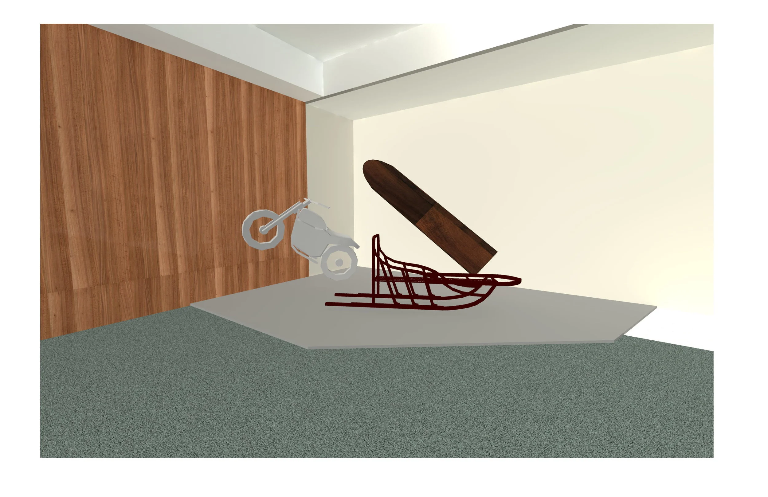
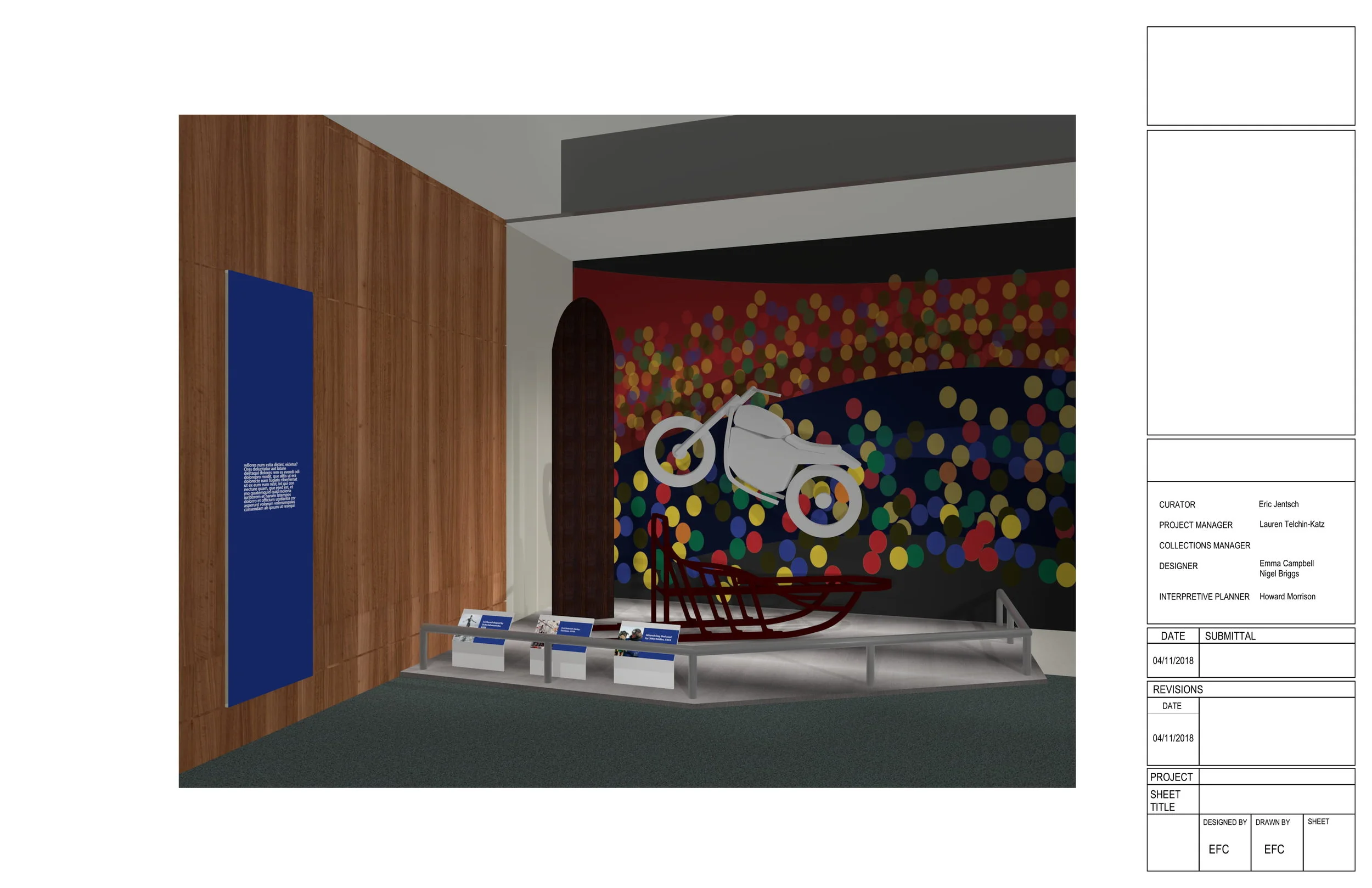
After this was resolved, and others had taken over work on the Ruby Slippers, I was given the latest objects to create two cohesive displays. The theme connecting the objects appeared to be sports. In the corner adjacent to the Ruby Slippers would be the Yankee Ticket Booth on its own. Opposite this would be the Evel Knievel's Harley Davidson, a surfboard shaped by Duke Kahanamoku and Libby Riddles’ Iditarod Dog Sled. I spent nearly a month in Vectorworks modeling the objects, changing their orientation, updating wall colors, and adding graphics (with updated text) from InDesign.
This was a particularly challenging project because it always felt like once I finally got all of the elements together, I would get information which would require a full rework of the project.
Early Designs
Updated Designs
Multiple times in my final weeks at National Museum Of American History, I met with curators, project managers, and other designers seeking final approval for the large objects. Usually, when returning from meetings I would only need to adjust a few things and then resubmit it to the team. However, close to the end of the design phase, the team received some important, but frustrating news. A decision had been made that the sled, surfboard, and motorcycle objects were going to be replaced by a Ruby Slippers gift shop. I had heard of projects being scrapped in their final hours but had yet to experience it.
After that meeting, I reworked that part of the design package. In the end, the Yankee ticket booth did go on display but in the opposite corner that I had originally planned on. As of the Opening in October 2018 the exhibit was mostly true to my design package. If not the exact labels, they were very similar, the acrylic barriers and a few other things. Upon a recent trip to the museum, it seems that the barrier had been changed yet again.


